6 tips for ensuring a great print result
You’ve gathered your images and are ready to embark on the journey of turning your memories into a keepsake to treasure forever.
To ensure the best print result for your images, here are some important things to note.
1. High resolution is key
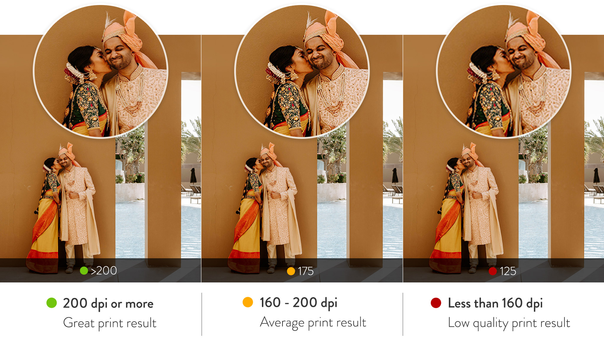
For the best print results, your images must be high in resolution or dots per inch (dpi). Aim for your images to be 300dpi or higher once added to an image placeholder. This is especially important if your image is in a full page or double-page layout. High resolution images produce a detailed reproduction of the image in print. If your image resolution is lower than 200dpi, try a smaller image frame, or you might wish to swap the image out with an image of a higher resolution. A low-resolution image will result in some level of pixelation in the final print.
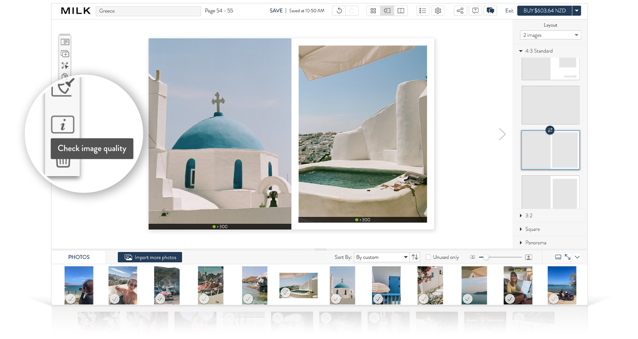
To find out the dpi of an image: In the Design Studio, turn on the image quality tool from the left-side toolbar while you're in spread view. Keep an eye out on the color indicator below your image. For a great print result, your images should indicate a green symbol at 200dpi or more.
Tip: Sometimes sentimental value outweighs print quality. Don’t be deterred from printing low quality images if they’re important to you.
2. Zoom in on your images
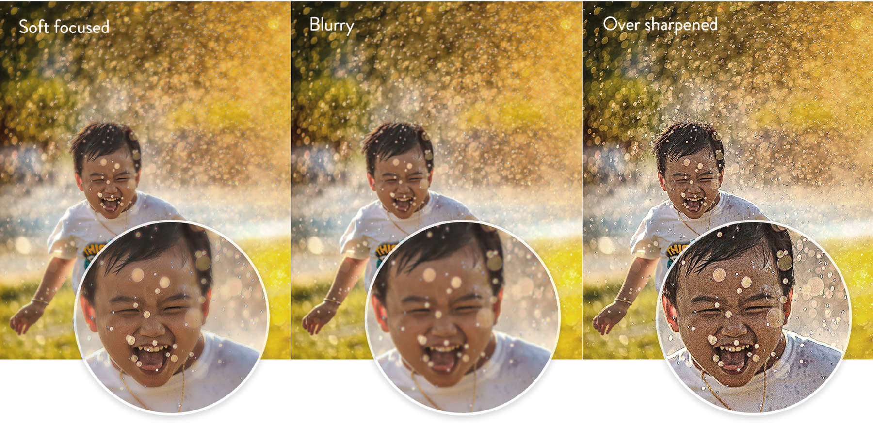
The best way to check for any quality issues in your image files is to do a visual check at an extreme zoom. Open your images on your computer and zoom in on them until you’re viewing them at 200% of their actual size. At this zoom you’ll notice any issues such as image blur, soft focus, a high level of image grain, pixelation, over-sharpening or anything else in the image that doesn’t look right. Any issues visible at this zoom will be visible in print. Swap out any problem images or approach your photographer if edits to the image files are required. Our Design Studio software will only flag images under 160dpi, and cannot signal any other quality issues within your images.
3. Dark images need your attention

If any of your images are looking slightly dark when viewing them on your computer screen, it is likely that these images will appear even darker in print. To get a better idea of how dark images will look in print, view them on a calibrated monitor or turn down the brightness of your monitor so that you are not viewing your images with intense backlighting. Before printing, get a professional to adjust any dark images or, if you’re familiar with Photoshop, lighten the images yourself.
Please note if you've had photographic prints made of your images, this will be more complementary to dark areas than digital printing. Therefore, lightening your images slightly in dark areas for your photo book or album is recommended.
4. Take care with black and white images

You may be surprised to learn that your black and white RGB images typically contain very little black and zero white, and are in fact printed in the same colors (Cyan, Magenta, Yellow, Black), that your color images are printed in. Be aware that any noticeable color tints (no matter how subtle), will be visible in print, and that any dark areas of your black and white images will print slightly darker. Extremely dark areas will lose detail unless lightened before uploading. Note that black and white images tend to have a visible grain especially if taken on film. This is not a defect, and is rather down to the style of photography. This grain will be emphasized in print, due to the digital print process. Once your order is placed, notify customer service of your black and white images so that our production team can pay extra attention to these during the printing process.
5. Paper choice is everything
Choice of paper is entirely subjective and guided by your personal taste. However, when it comes to digital printing, it is important to note the effect that paper choice will have on your images in print. In general, you can anticipate matt (uncoated) and shiny (coated) papers to have quite different print results. Shiny papers will give a crisper print result with more vibrant colors and deeper blacks, while matt papers will give a more subdued print result, with muted blacks and deepened colors. A textured paper surface will soften edges and create a flattering artistic effect with high resolution images. We offer a range of beautiful archival quality papers so be sure to choose the right one for you.
6. Check before you print
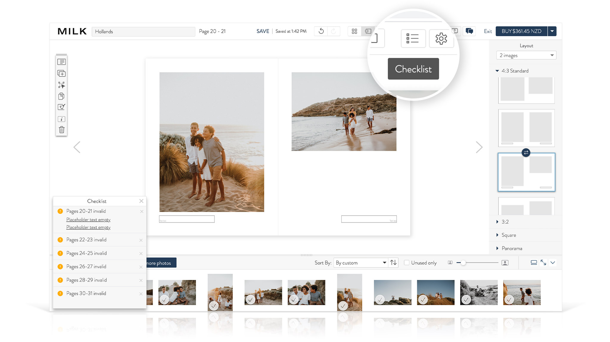
Check over your project for things like spelling errors and image double ups. Also be sure to clear formatting if copying text into your project and avoid placing faces in to the center of spreads; keep them within the safe zones. Your printed projects are designed to last lifetimes, we'd hate for you to be unhappy with the final result. But if you do notice a spelling error, MILK Books will provide you with a code to reprint at 50% off RRP if you contact us within 14 days of receiving your order.
For more information on our printing process, visit this page.