Timeless color palette ideas for weddings, from soft neutrals to rich seasonal tones
Your wedding color palette is one of the first visual decisions that helps shape the feeling of your special day. It can influence everything from the venue and florals, stationery and bridesmaids' dresses to your tablescape and signage. The right palette doesn’t need to be trend-led, it simply needs to feel true to you, your significant other and the atmosphere you want to create for your wedding day.
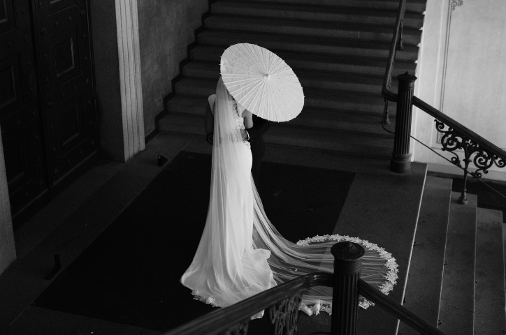
Defining a color palette ahead of planning brings cohesion to the details, helps guide style choices and creates a visual story that feels considered from beginning to end. Soft neutrals can create a feeling of understated romance. Rich seasonal hues can bring warmth and depth. Accent colors bring vibrancy and fun. A classic black and white palette can feel sophisticated and timeless.
The best color palettes are the ones that feel true to the couple. Shades that are as beautiful on the day as they are years later, when reliving the moments through photographs in your wedding album. As you begin brainstorming timeless wedding color combinations, think beyond the day itself, to how it will feel when preserved in print.
How to choose a wedding color palette
1. What is a wedding color palette?
2. How to choose a wedding color palette
3. Let your venue and season guide your palette
4. Timeless wedding color combinations we love
5. How your wedding colors will photograph
6. Carry your wedding color palette through the details
7. Choose colors that feel like you
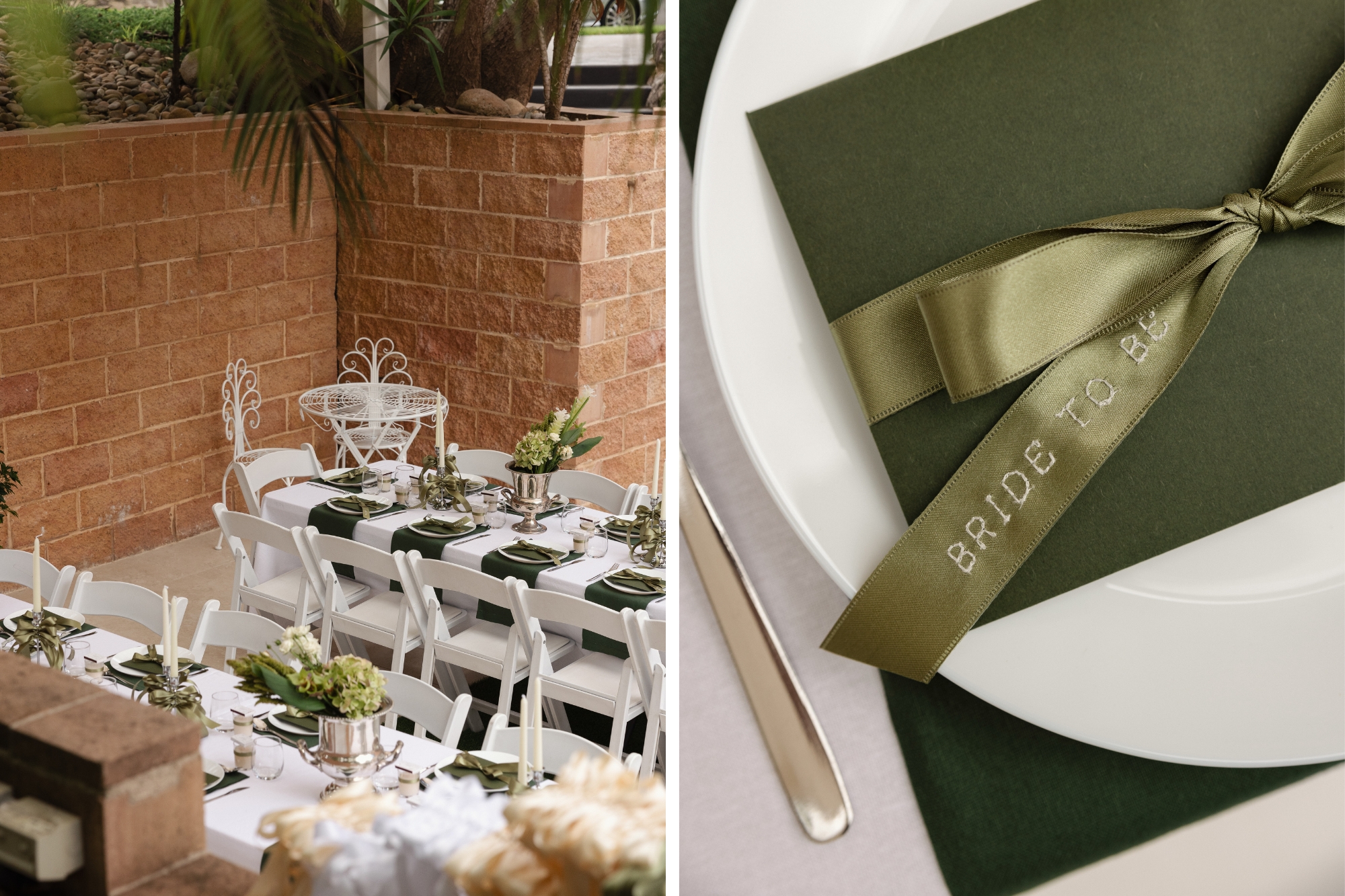
A wedding color palette is the collection of colors used through your big day. It can appear by way of invitations, florals and décor, but can also influence smaller details like candles, glassware, place cards and even the cover of your wedding album.
A strong palette usually includes a combination of shades. Soft bases paired with accent shades, or tones that work together to help create the overall mood of the day. Your wedding color palette doesn’t need to be strictly defined but rather can help guide your choices so everything feels connected, balanced and true to you.
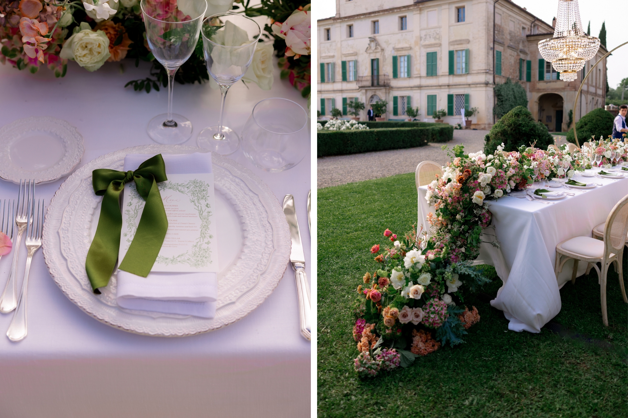
Start with thinking about what kind of feeling you want your wedding to have. How do you and your fiancé want to feel on the day? How do you want your guests to feel? Perhaps you’re imagining something romantic and intimate, modern and minimal, warm and relaxed, or joyful and full of color. Your palette should support that mood.
Before choosing exact shades, gather visual references of things that stand out to you. This could include floral arrangements, fabric swatches, interior styles, stationery, fashion or art. Look for colors that appear more than once. Are there recurring tones? This might be what points toward the palette that feels most like ‘you’.
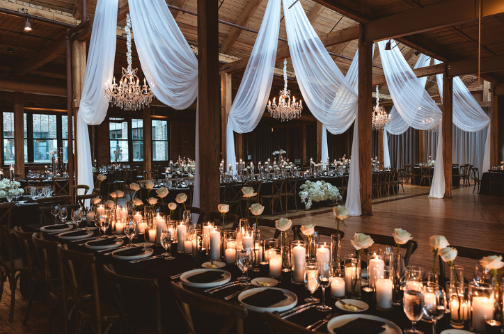
A romantic wedding might lean into ivory, blush and champagne hues. A modern, mid-winter winter might suit blacks, whites and deep red accents. A garden wedding in the summer could be sweeping with butter yellows, soft blues or vibrant pinks. For a destination wedding, sun-washed neutrals, terracotta, olive or sea-inspired blues can help reflect the setting.
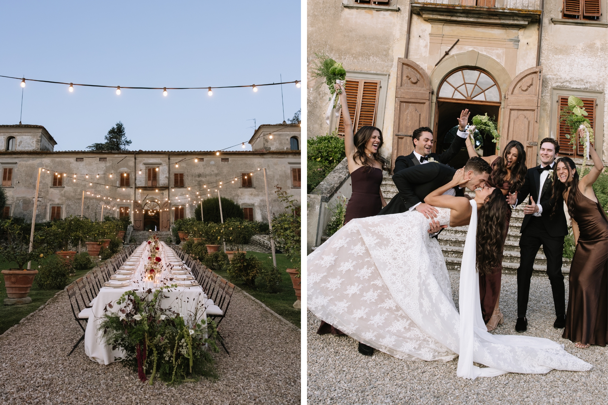
If you’ve already locked in a venue and wedding date, refer to this when preparing your palette. A historic ballroom, private dining room, coastal terrace, vineyard, inner city rooftop would all lean toward a different visual direction. Rather than forcing a color palette into the space, lean into what’s already there to inspire you.
Seasonality can also be a wonderful guide. It doesn’t need to feel obvious. A hint of the season; think blush and pastels for Spring, citrus, coral and warm whites for Summer, burgundy, plums and caramels for Autumn, and deep greens, champagnes and navy for winter. Used thoughtfully it can be a discreet but impactful nod to the season, connecting the celebration to a certain time and place.
4. Timeless wedding color combinations we love
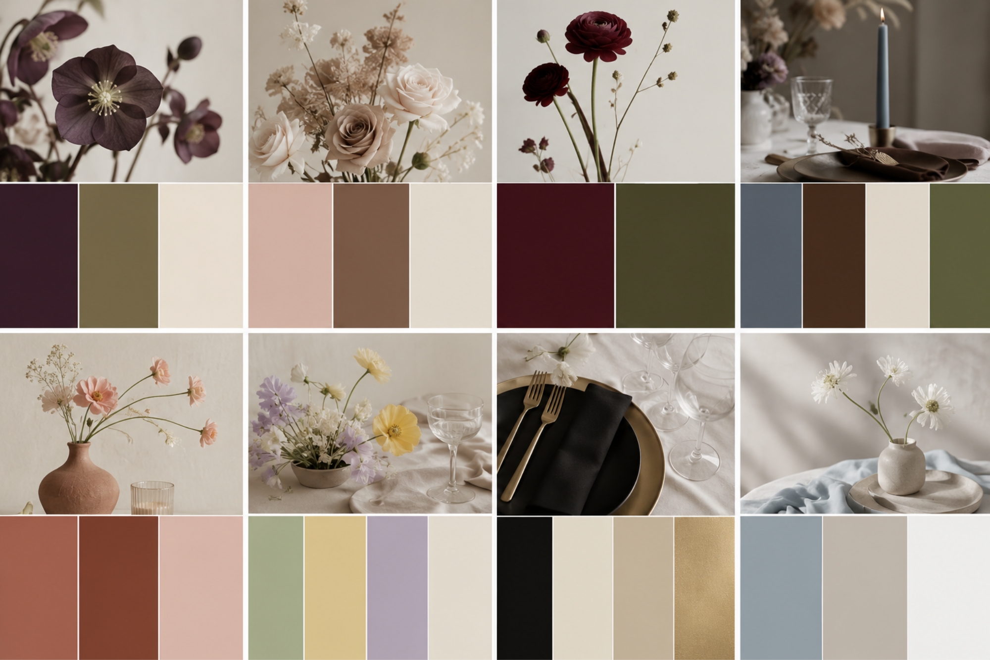
These combinations work because they feel layered rather than one dimensional. They give you flexibility across flowers, attire, stationery, table styling and more, allowing all elements of the day to feel connected without looking overly matched.
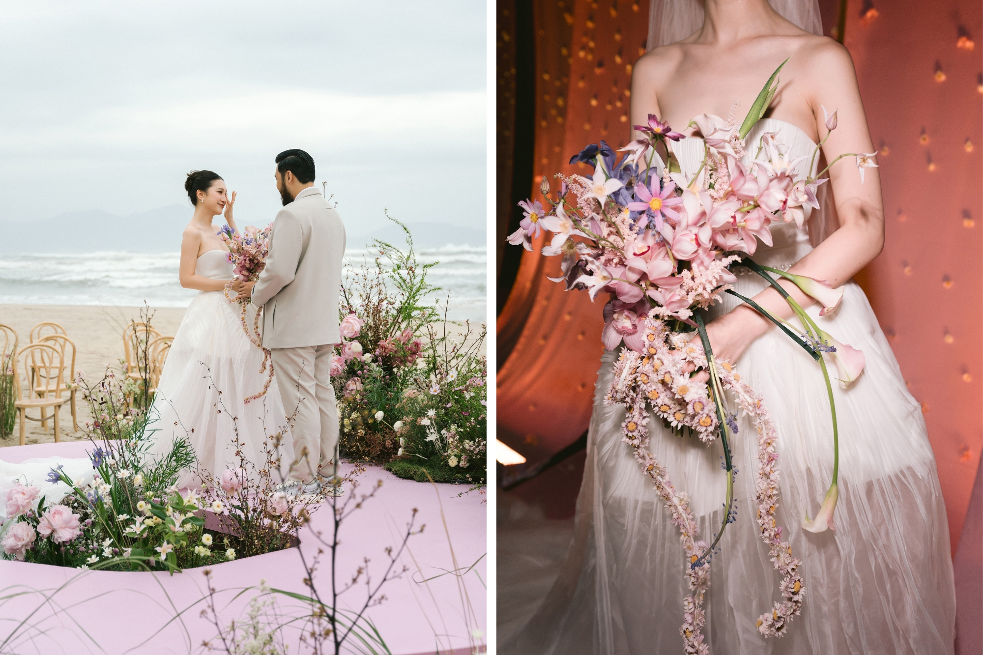
Your wedding colors will live on in your photos long after the day is over. It’s worth considered how your chosen palette and will appear through the lens and beyond. Some shades create softness and warmth, while others add contrast, depth and drama.
If you’ve chosen your photographer, it’s worth thinking about their style and choosing a color scheme that will complement and support it, rather than fight against it.
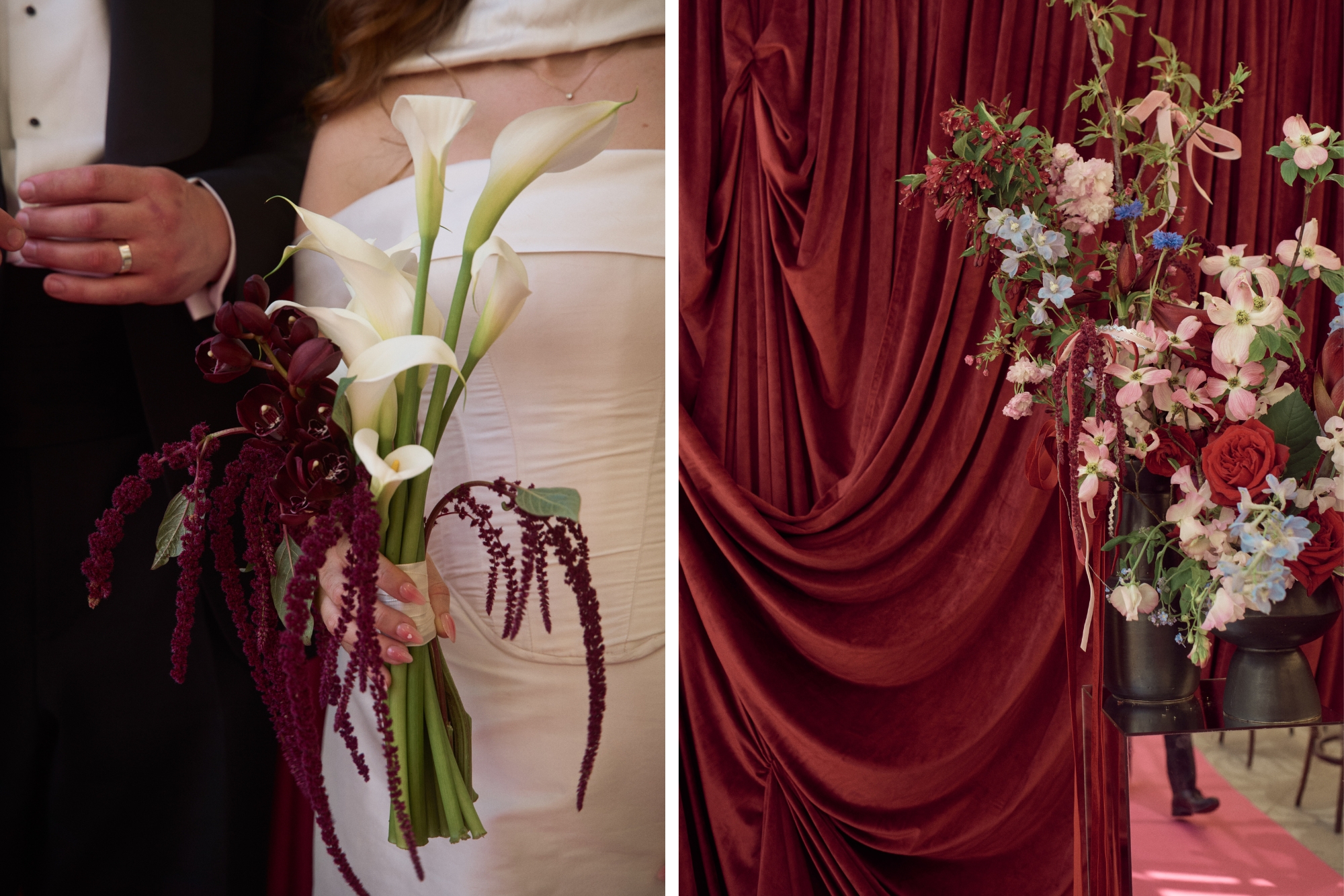
Once you have chosen your wedding color palette, use it as a guiding thread when choosing the details that will define your day. It doesn’t need to be overt, subtle uses of color are often the most beautiful. Consider referencing your palette across things like:
• Invitations and stationery
• Guest book
• Florals and greenery
• Menus and signage
• Table linen
• Candles and glassware
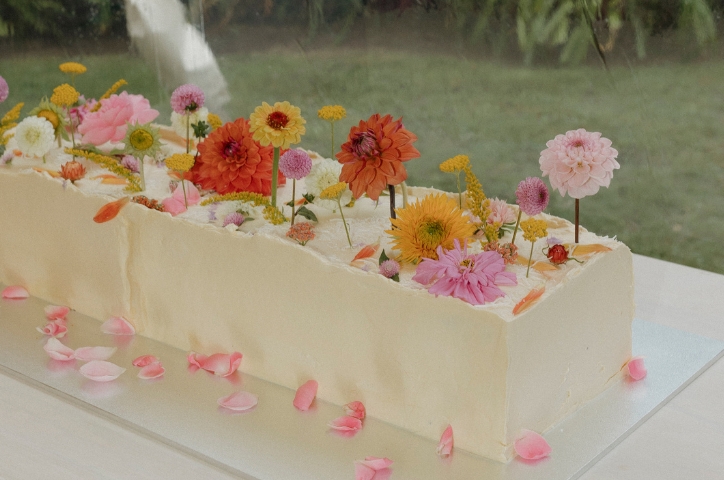
• Cake or desserts
• Wedding album
This is where your color palette becomes a part of the visual story of your day. The subtle connection between the details of your day creates cohesion without making the styling feel overly planned. When your wedding day is captured in photographs, these are the thoughtful details that will make the day feel complete and unique to you.
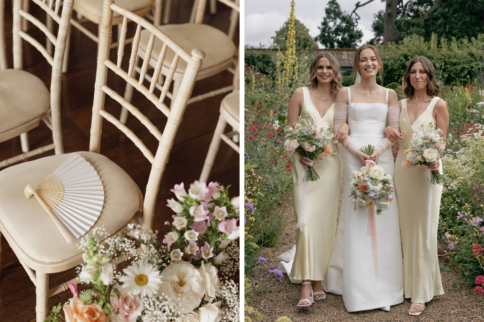
While it can be tempting to choose colors based on what’s trending, it’s important to choose a palette that’s personal to you as a couple. If you’re drawn to neutrals, lean on textures, shape and detail to add the beauty and depth. If you love color, use it intentionally. If you want something truly classic, lean into restraint. Your colors can reflect the setting, the season and the mood of the day, but ultimately they should reflect you.
Choosing a wedding color palette is about creating a visual story that feels personal, cohesive and timeless. Start with the feeling you’re wanting to create, before considering things like the venue or season. Build a palette that can be layered, with enough depth to tie all the details together. Whether you’re drawn to soft neutrals, vibrant accents or seasonal tones, the best color palette you can choose is the one that feels true to you and your celebration. Colors do more than style a wedding. They help shape how it is remembered. Long after the day is over, preserve all the details in a handcrafted wedding photo album, photo book or magazine, and relive the magic for years to come.