Find inspiration for your next project
Whether you’re creating a photo book, photo album, or magazine, the cover is often the most defining decision. It shapes the first impression, sets the tone for the pages inside, and determines how the book will sit within your home for years to come. While layouts and imagery carry the story, the cover frames it. The good news is that creating something distinctive does not require a design background. With our Design Studio, you can explore materials, colors and Typography in a simple, intuitive way and see your vision come to life.
Over time, we’ve seen customers approach cover design with care and clarity, using our design tools to reflect their own style. We suggest beginning with a cover fabric you feel drawn to, as this naturally sets the tone for everything that follows. From there, you can play with different cover designs, refining each detail as the cover comes together. The Design Studio makes it easy to preview combinations and adjust elements until the final result feels cohesive and personal.
Below, we share ten customer covers we love. Each one demonstrates how thoughtful decisions around fabric, color, and font can create a book that feels cohesive and unique, and how simple it is to bring those ideas to life with the right tools.
Cover designs we love
1. Silver Gray Leather with serif text
2. Full bleed image with serif text
3. Metallic Chestnut Coated Cloth with yellow serif text
4. Deep Blue Coated Cloth with serif text
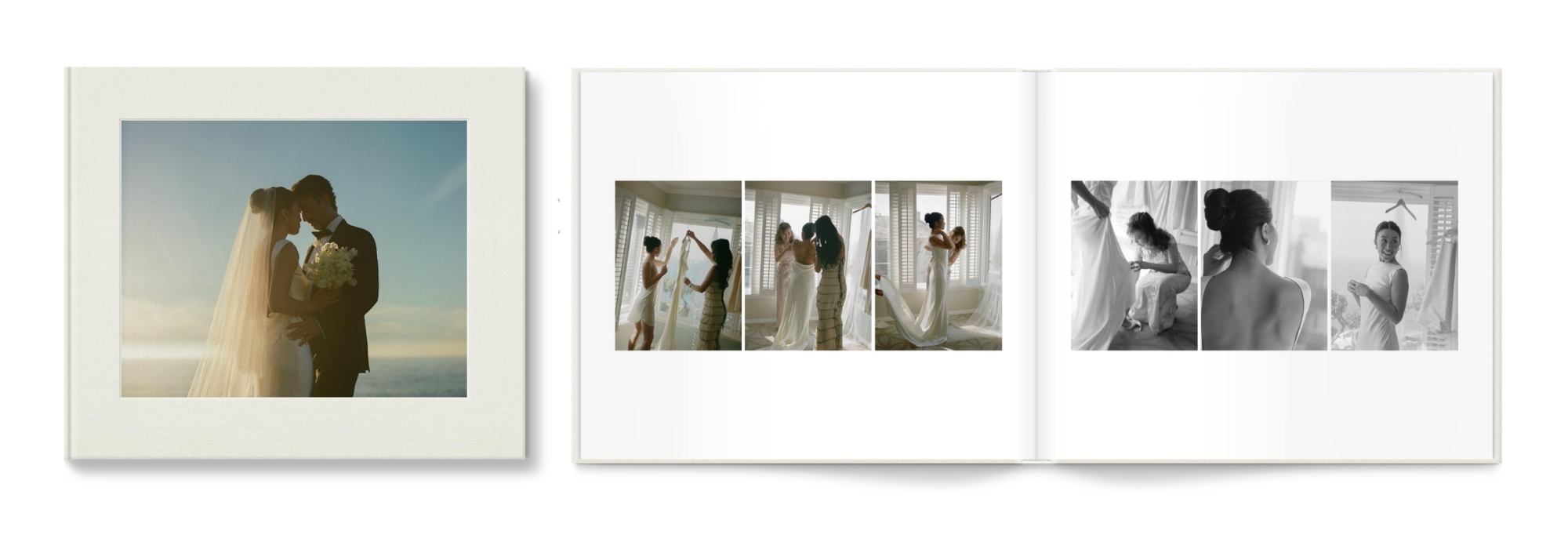
5. Ivory Premium Linen with red sans serif
6. Metallic Pearl Coated Cloth with pink sans serif
7. Black Coated Cloth with black serif text
8. Camel Vegan Leather with white serif text
9. Salt Premium Natural Linen with brown serif text
10. Metallic Pearl Coated Cloth with a laminated image
1. Silver Gray Leather with serif text
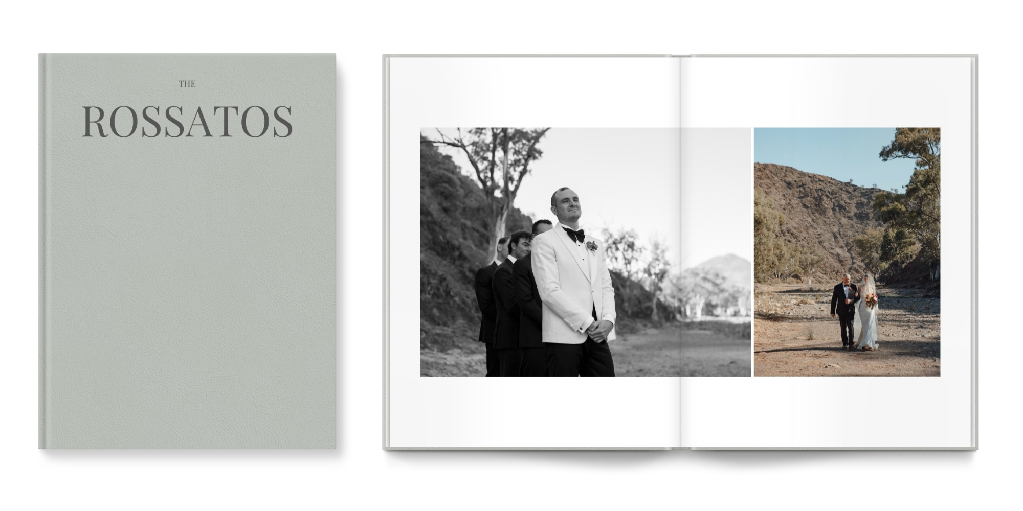
This wedding album pairs Silver Gray Premium Leather with the couple’s last name in the dark grey serif font 'Playfair Display'. The grey-on-grey palette feels sleek and restrained, offering a modern alternative to traditional wedding tones. The leather adds weight and presence, while the subtle contrast keeps the design cohesive. A refined choice for those who value tradition but prefer a quieter interpretation.
Flip through Holly’s photo book here.
2. Full bleed image with serif text
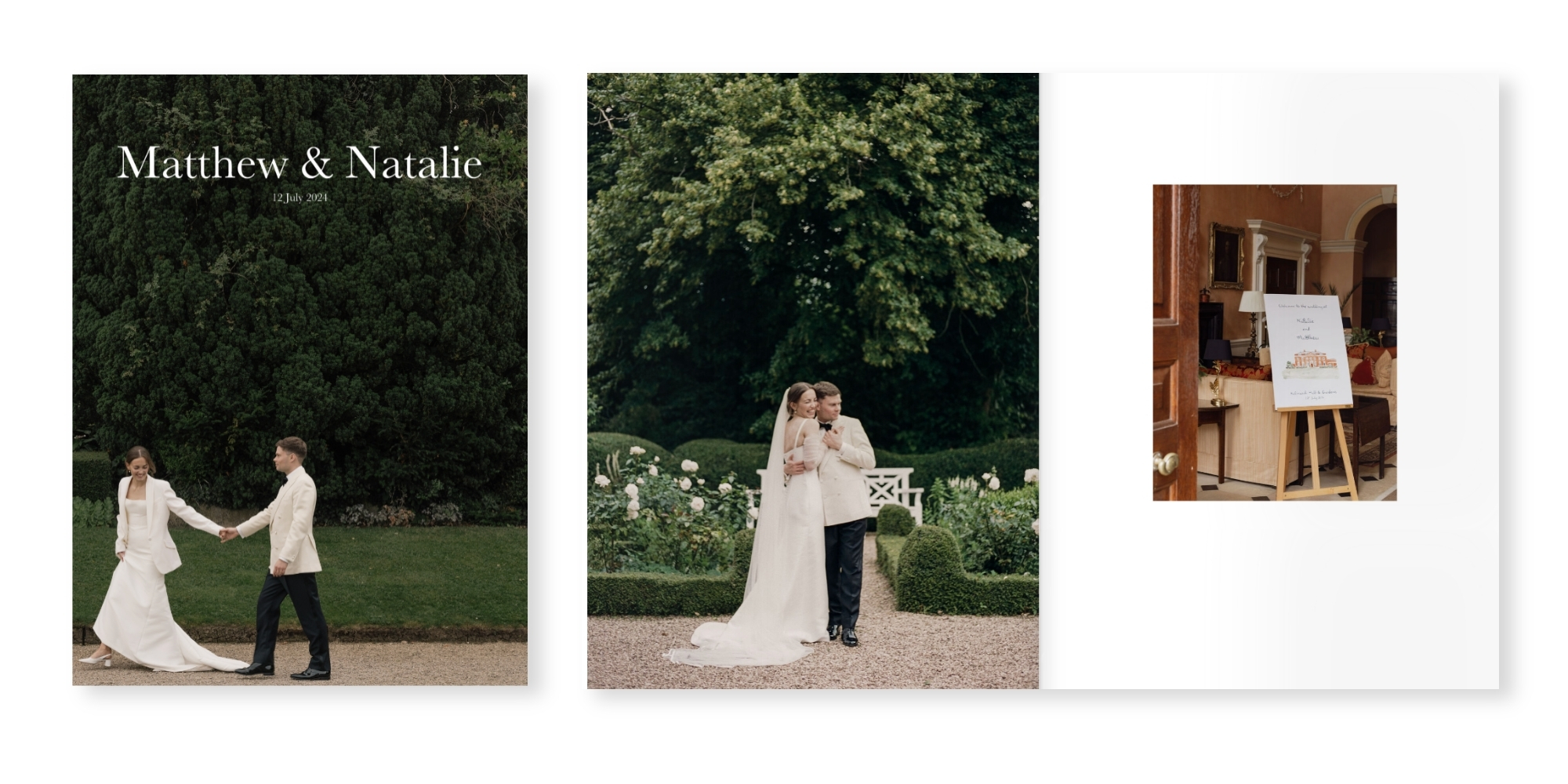
This custom wedding magazine cover centers on a bold, full-bleed image design, balanced with the Baskerville font in white. The result feels editorial and contemporary while remaining personal. Whether minimal or expressive, our Design Studio makes it easy to shape a cover that feels intentional and aligned with your style.
Flip through Matthew & Natalie’s magazine here.
3. Metallic Chestnut Coated Cloth with yellow serif text
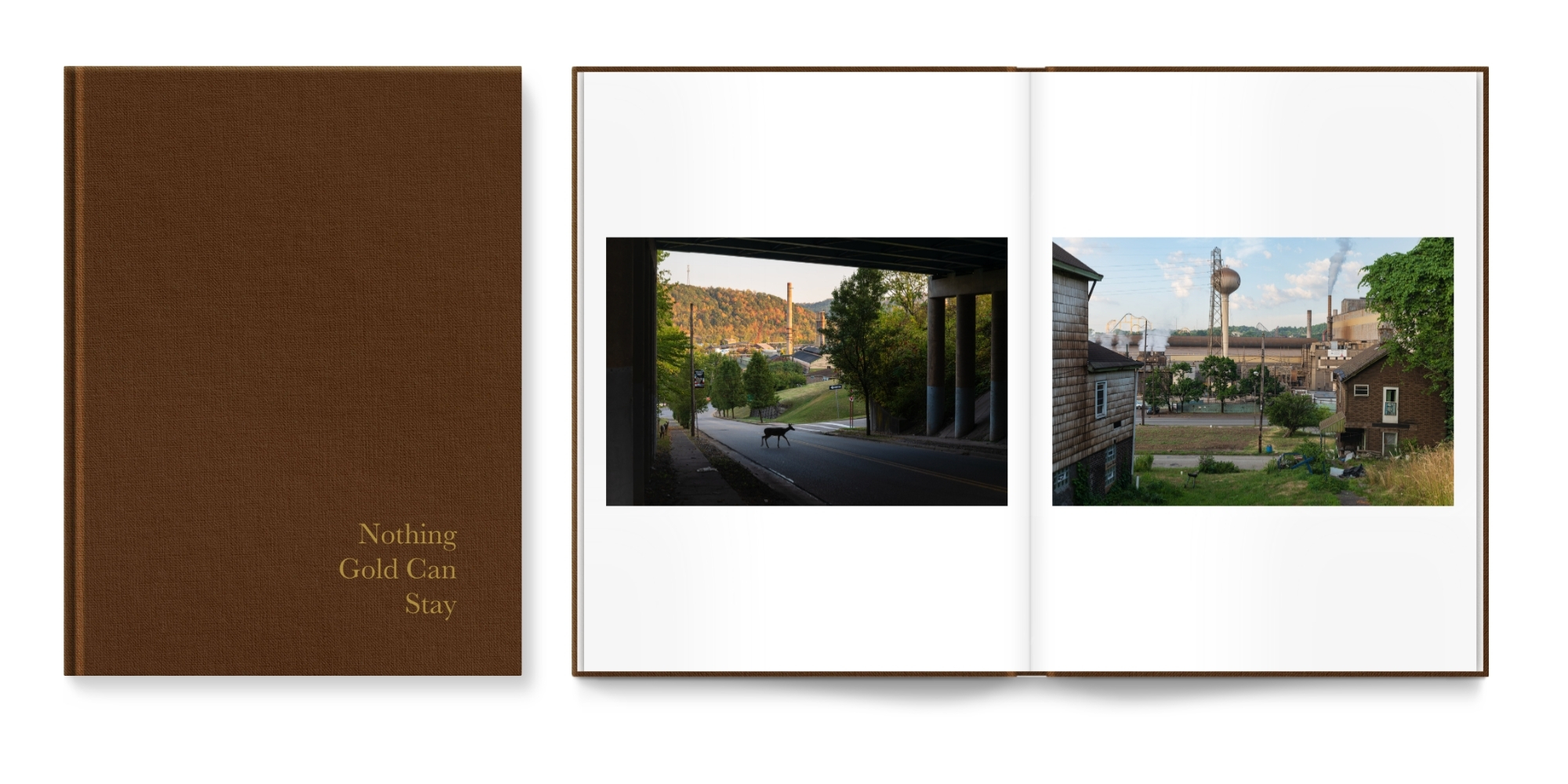
Our Metallic Chestnut Coated Cloth cover has a rich, warm depth and subtle pearlescent lustre, giving it a refined presence that feels quietly striking. A softly raised yellow quote in the font Baskerville adds gentle contrast while keeping the palette harmonious, and the right aligned text introduces a subtle point of difference. Together, these elements create a cover that feels expressive yet beautifully controlled.
Flip through Matthew’s photo book here.
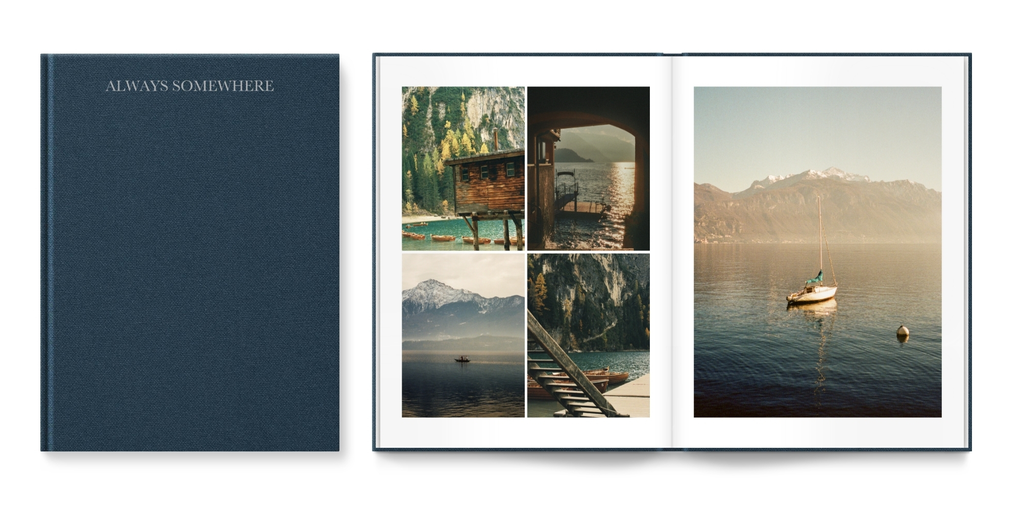
This Deep Blue Coated Cloth cover features our Baskerville font as the title positioned right at the top, creating a look that feels refined and purposeful. The rich blue beautifully echoes the natural tones within the travel photo book, while the elevated typography brings structure and a calm, considered finish.
Flip through Molly’s photo book here.
5. Ivory Premium Linen with red sans serif
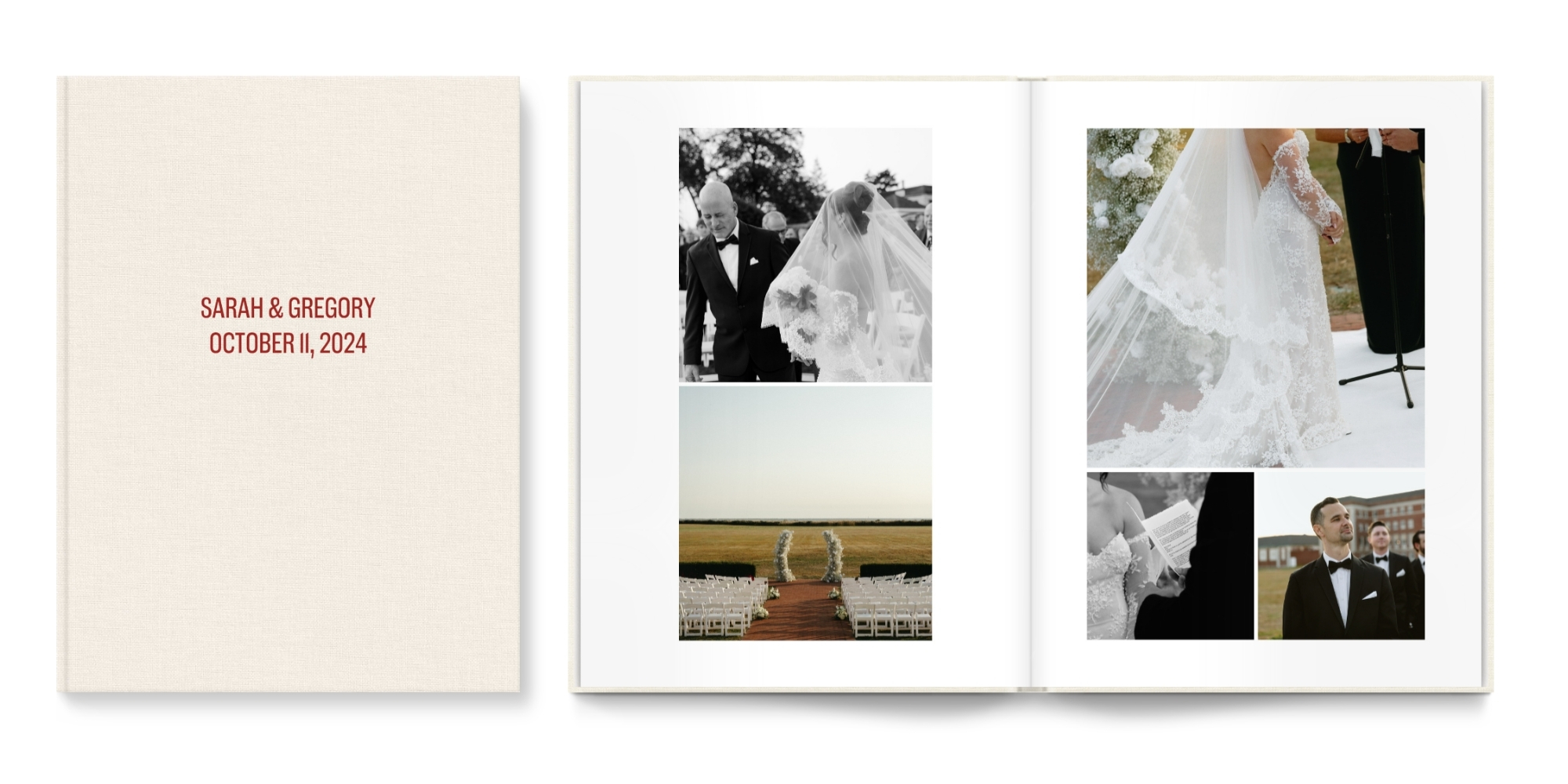
With its classic texture and color, Ivory Premium Colored Linen brings a sense of tradition, while the red sans serif font 'Americane Condensed' adds a modern edge. This pairing is a great demonstration of why finding the right font is so important. Typography can completely transform how a cover feels. The combination of classic material and modern typography creates subtle tension, resulting in a cover that feels balanced, refined, and chic.
Flip through Sarah & Gregory’s photo book here.
6. Metallic Pearl Coated Cloth with pink sans serif
With its pearlescent surface, Metallic Pearl Coated Cloth feels both celebratory yet refined, making it ideal for a wedding photo book or album. The pink sans serif title in the font Americane Condensed, reflects the softer tones in the photography, while clean, bold typography and gloss-finish bring the cover together in perfect harmony.
Flip through Uyen’s photo book here.
8. Black Coated Cloth with black serif text
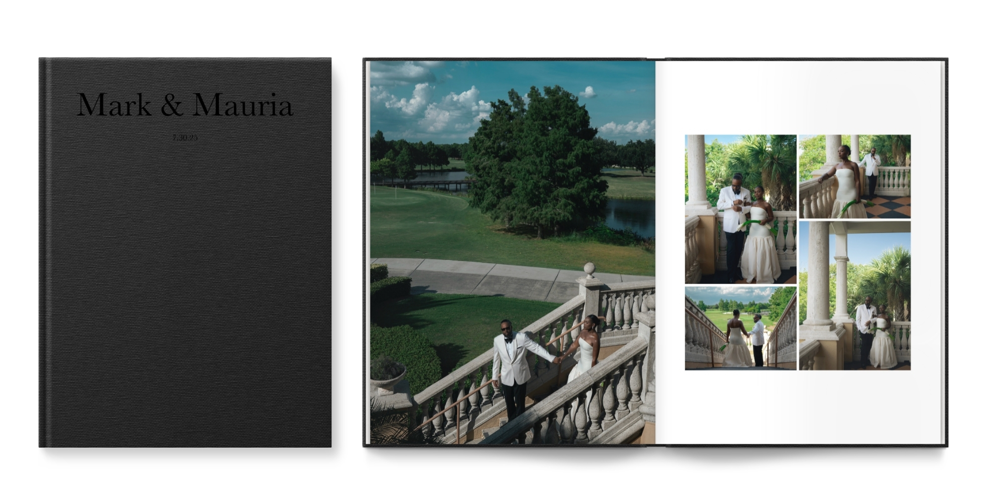
Strong and deliberate, a Black Coated Cloth cover lets texture do the talking. Set in Baskerville, the raised serif text creates a subtle tonal effect, catching the light softly, adding depth without seeking contrast. Restrained, considered, and quietly powerful.
Flip through Mark & Mauria’s photo book here.
8. Camel Vegan Leather with white serif text
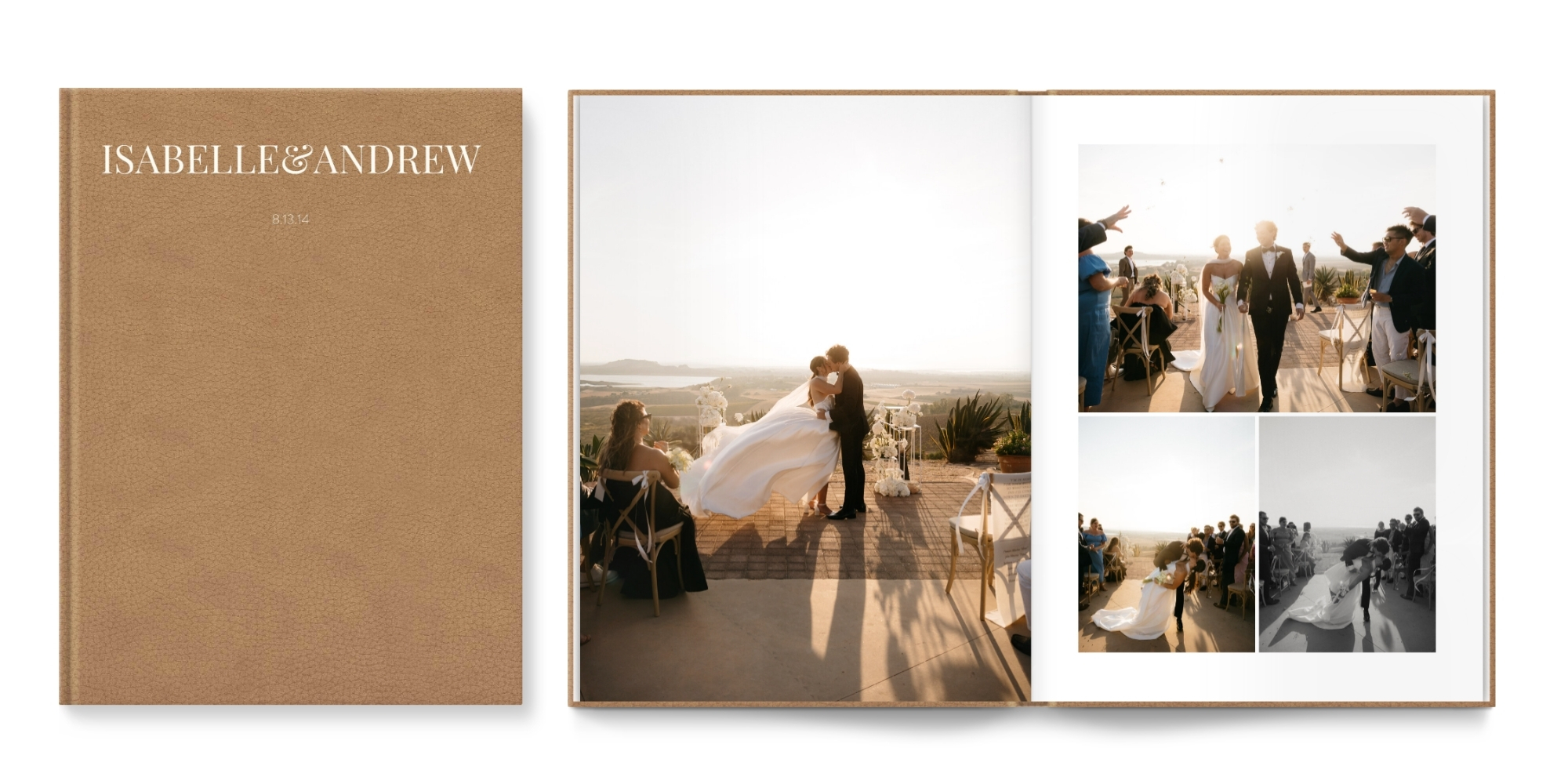
Camel Vegan Leather brings warmth and richness, making it especially suited to outdoor or golden hour imagery. The White serif title in the font Playfair Display adds crisp contrast while maintaining balance, resulting in a durable and refined cover that feels both contemporary and timeless
Flip through Isabelle & Andrew’s photo book here.
9. Salt Premium Natural Linen with brown serif text
This square photo album pairs Salt Premium Natural Linen with bold brown typography in 'Playfair Display', the textured base grounding the design while the lettering reflects the earthy tones within. Thoughtful use of format and scale keeps the composition balanced, resulting in a confident, theme-led cover that feels cohesive and considered.
Flip through Whitney’s photo book here.
10. Metallic Pearl Coated Cloth with a laminated image
Metallic Pearl Coated Cloth frames a warm toned image across this landscape cover, allowing the photograph to take focus while the subtle sheen adds quiet refinement. The wide format enhances cinematic scenes and creates a natural balance between expressive imagery and elevated finish.
Flip through Ashley’s photo book here.
10. The MILK Design Studio
You don’t need to be a designer to create a cover that feels considered and personal. Our MILK Design Studio is built to make the process intuitive and enjoyable, allowing you to experiment with Designer Covers materials, colors, fonts and placement with confidence. The structure is already in place. Our in-house designers have carefully developed the templates and typography systems, so every combination is balanced from the outset. You are free to play, refine and adjust, knowing the foundation is sound. Explore the MILK Design Studio and start creating your cover today.
For further inspiration, explore the MILK Gallery, where customers share their finished books. Seeing how others interpret materials, color palettes, and typography can spark new ideas and help you imagine what is possible. It is a reminder that while every story is different, thoughtful design always begins with clarity and intention.
Across these ten examples, the common thread is clarity of intention. Each customer made deliberate choices around material, color and typography to ensure the cover reflected the story inside. Some selected classic finishes and reworked them through font or color. Others embraced bold text or full image designs to create a stronger visual statement.
When creating your own book, consider not only what looks beautiful but what feels aligned with your story. Exploring different combinations in the Design Studio and making use of our tip videos can help guide your decisions, offering practical advice on layout, font pairing and cover balance as you refine your ideas. A well-considered cover will not compete with the pages inside. It will frame them, support them, and give your memories a presence that lasts well beyond the day they were captured.


